The UX Of Prototyping: Low-Fidelity Is The New High-Fidelity
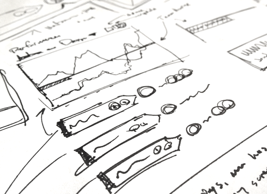
As a User Experience (UX) designer, I spend a lot of time with pen and paper, sketching interfaces, testing ideas, and fleshing out use-case workflows. I work exclusively in grayscale. This holds true for both sketching and digital prototyping. On paper, I use a black pen (Pilot Precise Grip, Bold) on white, unruled paper; on the computer, I use a single font-face (Helvetica Neue LT Std) and about 5 different shades of gray.
| |
|
|
||
| |
 |
|
||
| |
|
|
This was not always the case. I used to work in full-color; I used to work with textures; I used to work with photos. But, this lack of design constraint felt hugely limiting. It was a problem of cognitive load. I spent too much time thinking about artistic design and not enough time thinking about user experience (UX) design.
And so, I started to strip down my process. First I removed photos, replacing them with gray boxes; then, I removed all background images and textures, replacing them with solid colors; then, I boxed-in my designs in order to ground them; then, I standardized on font; and then, finally, I removed all hues, leaving me with a small set of grayscale variations.
| |
|
|
||
| |
 |
|
||
| |
|
|
Superficially, this journey was about removing frustration and playing to my strengths. But, the root of this evolution goes much deeper - it's a shift in focus from the incidental to critical. I believe Clark Valberg, CEO of InVision, summed this up beautifully when he said, "Low-Fidelity is the new High-Fidelity."
In this context, "fidelity" is not about graphic design; it's about importance; it's about interaction; it's about the user. It's about all the things that make software successful and transformative. By reducing the fidelity of the graphical user interface (GUI), you bring a lens of high-fidelity to the only thing that truly matters: user experience.

Reader Comments
This post really made me think. And I think your approach is ingenius. When I've prototyped up interfaces before I've fallen into all of the traps you've alluded to and ended up spending way too much time iterating through endless purely aesthetic design decisions for hours instead of focusing or isolating on the crux of the task: the interaction.
I don't totally agree with this statement: "It's about all the things that make software successful and transformative.", because I think the look and design of an application are extremely critical to its success ( at least for users like me that view software as art and the taste in our mouths during interaction is heavily flavored by the colors, gradients, photographs, and fonts used ). But I do agree that the things you're focusing on are high contributors.
Anyway, keep these coming. I love seeing how other C effers do.
P.S. If you ever can't figure out how to use an appropriate chunk of time you find, it'd be nice to be able to edit our comments. I have an OCD thing about misspellings hahaha ( ingenious ).
@David,
Yo, I can't tell you how much time I've wasted trying to pick the right shade of blue for an info-box... an embarrassing amount of time. And, I used to get into arguments about whose computer monitor (on the team) was showing the "correct" shade of a selected color. No joke, Embarrassing.
That said, I did just want to clarify that I do think the "designy" aspects of software are very important to the final product. A beautiful palette with nice textures and balance and weight can definitely bring a product to a whole new level.
The focus of this post was intended to be about the "prototyping" phase. Build out the prototype with a 100% focus on the user, usability, interactions, layouts, and workflows. Then, once you know the software works - once it solves the business problems in an elegant way - then put on the "high design" glasses and go to town.
And since I'm not a true graphic designer (I live in Adobe Fireworks, NOT Adobe Photoshop), that phase is most likely handed off to someone else with a real eye for colors and imagery.
@David,
Ha ha, I can dig it - probably a good idea :)
This is why I prefer Balsamiq for my wire-framing. It supports simple colors, but the default is line-drawing style. This help to reinforce that the design is still just a sketch, rather than a finalized implementation. Its more "breakable".
@Ben,
I don't know man. Fireworks is a pretty spectacular tool. I always saw it as the superhero-like love child of Photoshop and Illustrator. It can do most of the things that each of them can do in a single app and most of the time ( opinion ) more obviously, smoothly, and accessibly, as well as a slew of animation and web stuff that they never could ( or couldn't until recently ). Not good for preparing stuff for print or having "real graphic designers's" files import perfectly sometimes, but it was my go to and even in my graphic design and photoshop classes in school I'd use it on the sly and just convert my projects to photoshop right before turning them in because it let me go a lot faster than all the students using Photoshop. End rant.
@David,
Whoa, didn't mean to misrepresent. Fireworks is the *best web design tool* ever created :D If you need serious photo manipulation and tons of effects, go Photoshop... but for basically everything else web-dev related, Fireworks is where it's at. It's the only graphics tool I use. The fact that Adobe has all but end-of-life'd it is very sad :(
I see people struggle to do simple stuff in Photoshop and it makes me feel bad for them. Fireworks removed all of the pain from anything vector-based. And, still has lots of bitmap related features.
@Jon,
Balsamiq is definitely a popular tool. But, for me, Fireworks has a level of efficiency and freedom that I can't get from the off-the-shelf wireframing tools. But, I was very luck - I worked a job years ago where day-one, they said, "Sit down and take 3 days to learn Fireworks - it's all we use." Those three days have had a payoff that has echoed for years.
Having an email subscription would be nice as well.
I have ifttt.com send me an email whenever you post something because I never remember to pull up an RSS reader, but I do read email.
Prototyping can be a really difficult concept to explain to some people, and not everyone can do it well.
I've used Fireworks since 1998, and if I could boil it down to a single signature feature, it would be symbols. Named symbols, instances of symbols, symbols composed of other symbols, the ability to edit the original and have all the instances update -- each with its own size, position, filters -- incredibly useful.
@Ken,
I used to use Symbols all the time in Flash; but have not used them too much in Fireworks. I did dabble a bit, especially with trying to share them across different files, using the Library. But one frustrating thing I found was that if I updated the symbol, I would have to go back into each file and actually re-update the symbol manually, before exporting the images again.
I did find some sort of Fireworks plugin that I think did that for you; but I ended up going in a different direction.
I really should get serious about the more advanced features of Fireworks. I bet there's a lot of untapped power here that I don't even know about.
@Lola,
That's definitely true; which is all the more reason to strip away more things to "think" about. Less distractions.
Ben, et al,
Your post strikes close to an issue I am intimately familiar with. At my shop we have three distinct development teams, each using a different dev technology (.NET, CF, and Perl/open source). We realized within the last year that only the .NET team has been using wireframing / prototyping with any consistency. They use SketchFlow, which works well in that environment, but there are some issues even there.
We have since struggled to implement wireframing on the CF side as it is a fundamental shift from "how we've always done things." In the past, we have used fully styled Photoshop mockups to demonstrate intended functionality (UI), and then developed directly from the already styled mockups. This typically leads to a substantial amount of back and forth about both style and UI as we are already developing, which is, of course, a bit of a hassle.
Wireframing helps avoid that, as the UI is well established (at least in theory) before any code is written. Our main struggle is from trying to insert what is essentially another new process step into the dev cycle, which is perceived as unnecessarily slowing the entire process down. (I think we can probably argue that it actually saves time in the long run, but it can be an uphill battle.)
The other issue I have experienced is that the unstyled wireframe somehow becomes the reference for the style itself. Use cases now include screen shots of the wireframe, and any deviation from the wireframe is balked at even though it was only intended to provide general UI cues.
How do you make that distinction in your efforts? (Where do you draw the line between "style" and "UI"? Especially for purposes of documentation, how do you effectively differentiate between the UI and the "style"?
For our wireframing, I grabbed a copy of my "jQuery Mobile First Look" book off the bookshelf and said something like "These are the things that are available."
So there wasn't any real wireframing per se, it was just referring to the jQuery Mobile website and book to see what tools we had.
@David,
It's a bit of a fuzzy line. I try really hard to keep things low-fidelity as a UX designer. However, there are definitely times when I have a specific vision of how something should be; in those cases, I will stick with the given constraints (ie. single font, few shades of gray), but I will try to give it a more in-depth exploration. This is especially true when I want to create some new type of widget that we don't really have - like a combo button/dropdown... or any other kind of "widget" that I want to move in a given direction.
The saddest thing, I think, is when I actually prefer the look of the wireframe / prototype to the high-fidelity version. It doesn't always happen; but, sometimes the low-fidelity version provides the best experience, which then becomes diluted by the high-fidelity design. Such situation are thick with irony :)
But, that said, in the end, I end up not being the one who has to enforce style. I create the low-fidelity prototype, which is then updated by a graphic designer who applies all the branding and the "style." That's the version that is then typically passed off to the developers. And, at the end of the day, the product manager won't approve code that doesn't create UIs that deviate [too much] from the high-fidelity design.
Not sure I even came close to answering your question, sorry. We use the prototypes (or portions of the prototype) as the UI documentation. And the product manager makes sure the devs follow that design work.
@Phillip,
I'm not sure I follow what you mean? Are you saying that you looked at the list of widgets provided by the jQuery UI and let that be your style guide?