
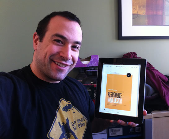
A Book Apart: Responsive Web Design By Ethan Marcotte
Last weekend, I read Mobile First by Luke Wroblewski. It was a compelling read that talked about the broader benefits of designing to the constraints of a mobile experience. At the end of his book, he suggested that Ethan Marcotte's book on Responsive Web Design would be a perfect compliment to the "mobile first" approach to web development. And so, with a long train ride this past weekend, I picked up Responsive Web Design and gave it a read.
| |
|
|
||
| |
 |
|
||
| |
|
|
"Responsive web design," has become a pretty popular topic on Twitter and in the "blogosphere." And yet, before reading Ethan Marcotte's book, I wasn't quite sure what it was. I knew that it had to do with accommodating a variety of screen resolutions; but other than that, I wasn't sure - I've been historically slow to learn about anything that appears to be geared towards mobile development.
The biggest question in my mind, going into the book, was whether or not, "responsive web design," was supposed to be a replacement for mobile web site development. I have very mixed feelings about what I want a mobile experience to be. As the owner of an Apple iPhone, I tend to like having the "desktop" version of websites with the ability to zoom and pan the touch-screen. That said, I don't actually do a whole lot of reading on my iPhone - it's used primarily for quick look-ups, email, and apps (Twitter, Chase, NPR, This American Life, etc.).
After reading Mobile First by Luke Wroblewski, however, I definitely found myself enjoying the idea of creating websites optimized for the kinds of actions that mobile users might typically perform. That said, I have also many times found myself frustrated that I couldn't access some desktop-version piece of functionality from my mobile device (I'm looking at you, Twitter).
Ok, so to frame the rest of the conversation, let's first answer the question as to whether or not "responsive web design" is supposed to be a replacement for mobile web development. For this, I'll defer to a passage in Ethan Marcotte's book:
But most importantly, responsive web design isn't intended to serve as a replacement for mobile web sites. Responsive design is, I believe, one part design philosophy, one part front-end development strategy. And as a development strategy, it's meant to be evaluated to see if it meets the needs of the project you're working on. Perhaps there's a compelling reason to keep your site's desktop and mobile experiences separarte, or perhaps your content would be better served by a responsive approach. Only you and your users know for certain.
While I agree with mobile web designers who say that certain users of certain sites deserved different content, I think the reverse is also true: many sites can benefit from serving one document up to multiple contexts or devices. And those are perfect candidates for a responsive approach. (Page 151 of 217)
Ok, so "responsive web design" is not intended to be a replacement for mobile website development; but, it certainly can be depending on the type of website you are creating.
So, what is "responsive web design?" It's basically a combination of flexible layouts and CSS (Cascading Style Sheets) media queries that can be used to change the rendering of existing HTML based on the dimensions of the current browser window. It's not about serving up different content to different devices; rather, it's about serving up a single repository of content and then using different stylesheets for different devices and resolutions.
To me, this sounds complicated. Fortunately, Ethan Marcotte does an excellent job of breaking down the concept into simple topics and then explaining how each aspect works. As an example, he took the complexities of using EM for font-size and percentages for width / margin / padding and created a simple mathematical formula to follow:
target / context = result
He also advocates putting the above equation directly into the comments of your stylesheet:
font-size: 1.5em ; /* (24px / 16px) */
padding: 0px 4% ; /* (20px / 500px) */
This allows the developer to mentally model the display based on a more tangible pixel-based system while defining the actual formatting using flexible units of measurement.
It's tips like this that turn the big hairy topic of responsive web design into something that feels quite manageable. Even to someone like me that uses "px" to define everything!
At first, the conversation takes a "scale down" approach to understanding responsive web design - that is, how can we take our desktop version and scale it down to fit smaller screens. After the concepts of responsive web design are broken down and examined, however, Marcotte goes on to explain that a "scale up" approach is probably the most beneficial.
When using a "scale up" approach to responsive web design, we get the benefits of a "mobile first" thought process and we don't have to worry about device capabilities. If a particular device doesn't support CSS media queries - and it lacks the ability to use JavaScript work-arounds - it doesn't matter; since a mobile-first approach can work on all devices, we are guaranteed to have a usable, functional experience no matter what environment the page is being rendered in.
Responsive Web Design by Ethan Marcotte really does a great job of taking an intimidating topic and making it quite accessible. I have yet to put any of this into practice; but, I'm definitely looking forward to using responsive web design as a way to help "future proof" website development. Definitely a recommended read.

Reader Comments
I am doing a project involving responsive design, check out getskeleton.com. So far I am enjoying working with it.
@Adam,
Thanks, I'll check it out. I don't have much experience with grid systems (in general). Definitely looking forward to seeing what kind of wisdom they can bring to the table.
Thanks for the info, definitely gonna check it out!
Good informative stuff defined
@Steve, @Janey,
Enjoy!
Recently i am collecting materials regarding Responsive web design. I think Ethan Marcotte's book will be perfect guide for me. Thanks for the share
Hey that was really needful. Thanks for sharing. I'll surely be looking for more.
Great article Ben - I am loving some of the new responsive sites that are coming out!
I recently experimented with responsive web design. I love the concept, but in practical application, I don't think its necessarily always right for mobile sites. It works wonders for adapting a standard website for tablets ... but the mobile user fundamentally needs different (and less) content than the typical website visitor. For this reason, simply *displaying* the content differnetly falls short of a good user experience for mobile, in a lot of cases.
Thanks for the nice post on responsive web design.
Definitely I will check it out.
Anyway thanks for sharing your opinion.
Thanks for sharing this post about responsive design. I gain new information about responsive design from your post, it is very helpful for me
http://www.pumpkinwebdesign.co/web-design-chorley/
This article gives the light in which we can observe the reality. This is very nice one and gives in depth information.
Thanks for the information, as now the website are being accessed by various devices and resoulation, screen size Responsive website http://www.clickpointsolution.com/responsive-web-design-services is very much essential to provide exact information for the world. Also in the other hand adoptive approach also can be implemented depends upon the requirement. It is difficult to maintain two different website, but if the main website is major content based adoptive approach can't be avoided.
Thnx