The New BenNadel.com - Same Content, Fresh New Look
My site, www.bennadel.com, is just over three years old. It's been a great three years and I've been very happy with the way she's been running; but, I thought it was time to give her a fresh new look - something that's a bit more professional and a lot more personal. I like to feel that I'm a big part of the ColdFusion community and I wanted my site to reflect that feeling.
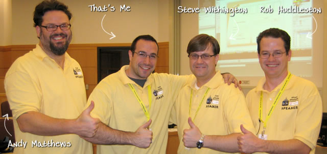
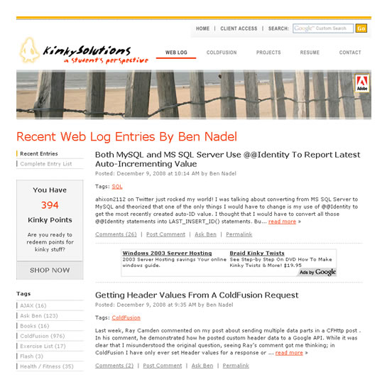
Here's what you've all been used to seeing over the last few years:
| |
|
|
||
| |
 |
|
||
| |
|
|
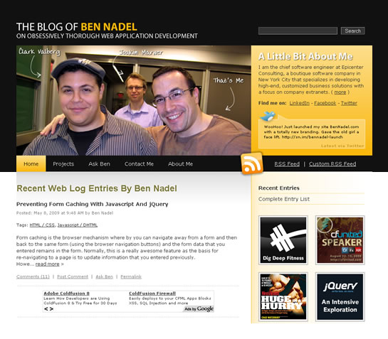
... and here's the new version which you're seeing right now:
| |
|
|
||
| |
 |
|
||
| |
|
|
While it's still the same functionality, I'm really excited about the updated look. I hope you all enjoy!

Reader Comments
The new look is great. Bold. Plenty of negative space and clean CSS file/html.
Well done!
Nice, Really good work.
Thanks guys :)
Looks slick Ben, congrats :)
Nice re-touch, Ben, looks great!
Digging the new look, Ben. Great work redesigning :).
You havent arrived until your photo giving the thumbs up with Ben is featured on bennadel.com, I'm adding it to my list :) BTW, Great new look Ben, congrats!
Awesome! I see you made your URLs SEO friendly too!
heh, they've been like that for a while haven't they?
Looks fabulous!
nice work ben, update looks great
Nice job, looks great.
I like it very much. I think the only thing I would suggest is a slideLeft() on the pictures when you click Next.
Do you manually put the names on each picture or is there some fancy programming happening? I love the picture of Ye. She is as cute as ever.
Looks great Ben. Keep up the posts.
Looks absolutely incredible.
Coooool design!
Awesome look Ben!..
Awesome and looking really cool Ben. We can called it as Shortcut to Brilliant Re-design :-)
With no connection whatsoever...you are very handsome! :">
With no connection whatsoever...you are very handsome! :">
Great design Ben!
I will miss the old layout though. *ah, the memories*
Keep up the amazing work.
Excellent work.
Nice work Ben - Glad to see the "ads" survived :)
Pretty sweet
Really like the new design, especially the picture section at the top, nice to have faces to names on a blog!
Great job on the redesign. :) Thanks for being part of the community.
Looking good!
@All,
Thanks a lot guys! Awesome feedback. I'm really excited about this... and really excited to get lots more photos at cf.Objective() and CFUNITED!
@Glen,
I really like that idea - I'll see what I can do about the slide in.
@Serene,
Don't ever feel pressure to come with *reasons* to say that :) You can say that all day long if you want!
Nice job Ben, you'd almost make a good designer ;)
Love your work.
Nice job, Ben!
Props on the new look. I like the Pittsburgh colors. Now all you need is a photo of you and Jerome Bettis to complete the collection.
I didn't know you were speaking at CFUnited? Congratulations on that too. It's about dayamn time.
It looks very nice ... Great
Even people can know more about u "and a lot more personal" ;)
Congratulation ... keep going
Nice work Ben!
Great re-design. I like the slideshow at the top and the organization of everything.
Ha! I thought I was on the wrong site for a minute. Pretty slick!
Very nice!
@Ben,
By the way, looking forward to finding you at cf.Objective() this week. I'll buy you a seltzer! Peace.
been reading your blog for a while now, gotta say i like the fresh new look. Did you partake in the designing?
Love the new site, especially the pics w/ links at the top....I'd love it if you shared the info for that sweetheart app!
I'd also be interested in where the design came from, it's pretty sweet.
Thanks everyone. The photo rotation on the top is just done via some jQuery and some AJAX calls.
The design is part innovation, part borrowing, part what was already there. Hopefully, I'll keep making some neat little updates to it here and there.
What?!?! You mean I don't have to answer the "What site is this?" question to all my CF friends when I send them links to CF advice on your site? The old header image...ahem....seemed a bit familiar to many of our bachelor party days ;-)
@Dan,
I am sure I can come up with other ways to make your friends feel uncomfortable :)
two thumbs up Ben!
Nice work, I dig it!
Looks great, Ben. Nice work.
Nice job ben laden. : )
Ben, so you finally gave in eh? No more inappropriate and suggestive material! Dude you did a great job with the new design. Super impressed! Keep it up!
Great pictures, and great site redesign! I came back to look at an old blog post, and when I got here I wasn't sure I was on the right site. Glad to see you're keeping everything fresh and current. Thanks for all your hard work.
muy buena pàgina, saludos
good show... I was tired of having to explain that "kinky solutions" was a coldfusion site and I wasn't looking at pr0n on company time.
Minor suggestion. On the H3.blogcomments you might want to put the number of comments. Like 54 User Comments.
Also, something BIZARRE is happening in Chrome. This comments text box is growing every second. On each second it gets about 10 pixels taller. It's ginormous now. How cow! Just click in the comments box in chrome and it grows and grows! Is this "Project Huge"?
*cough*
http://www.fourhourworkweek.com/blog/
Similarly similar :)
wow, two thumbs up!
@Glen,
Yeah, I am trying to figure that out. People tell me that it also happens in FF2; but, I have not been able to duplicate this issue on any of my browsers, both Windows and Mac.
@Justin,
I was most inspired by Tim Ferris' blog. See, my whole redesign idea started out with the desire to put pictures at the top of my site. My old site had some generic beach shot, but I wanted to make things more personal - more expressive. This is a surprisingly hard problem to solve since even at my old site width of 770px, pictures really have much more vertical content than they do horizontal content; meaning, with a short display, its almost impossible to show a cropped picture that is still meaningful.
I played around with a bunch of ideas, but I couldn't come with anything that I liked. Part of the problem was that I was stuck in this box of keeping the site 770px with a short header and a left-hand navigation.
When I saw Tim's blog, I felt that his site had solved this problem well so I started out with the same basic layout of larger photo left and info box right. Then I went even larger with my header and wider with my site; I figured once I was already going larger, I might as well get even bigger than that so that I can display nice photos on the screen. Plus, after looking at my Google Analytics, I decided that few enough people with 800x600 browsers ever visit. And, if they do, the primary content is now on the left, so at worst, the navigation will be cut off, but the content will still be visible. But, I really wanted to take the photos to the next level and spent two days getting that Javascript rotation to work :)
No doubt, without his site inspiration, I would have never come up with this one. Having read his book, The Four Hour Workweek, I am sure he would be proud :)
@JC,
Believe it or not, that was definitely an angle that I took into consideration. I even changed the fav icon, but it seems to be caching on my browser.
@Ben,
I realize my comment was probably a bit short and without explanation. Sorry, was browsing while at work ;).
In March I began work as a Coldfusion developer after being laid off at another local company as a beginner .net developer. Youre blog has helped me tenfold and I cant thank you enough.
Anyways, I like the new site.
Dude, the site looks great. Nice job.
I need to get my pic with you at CFUnited!
Hey Ben, nice redesign. Love the pictures. Great community feel, and yes, you are a big part. Congrats on both counts.
One little niggle about the new design, an issue in FF 3 (only, it seems, from my testing), regarding the search box in the upper right.While it has a black text background (and white text foreground) in Chrome and IE 7, it has a yellow text background (inside the box, I mean) in FF 3. With the white text, that makes what we type virtually unreadable in FF 3. Just thought you'd want to know. Keep up the great work, as always.
A like your website redesign very much...
Very nice job.
However, regarding fourhourworkweek.com/blog, I'd have to say Ben's code is sexier.
Nice Ben ... Good Clean Design ...
@Ben: Looks sweet!
@Charlie: Could that yellow text box background be from the Firefox browser itself, or a FF plugin? I recall seeing this happen when you have FF remember your entries or something like that... In any case, my FF3 browser shows a black background there, not yellow. Again, I feel like I've run into that before and it was Firefox overriding the site's CSS, but I can't recall the exact details...
It turned out great, Ben! Keep up the great work!
@Charlie,
I think that's probably an auto-fill issue. I think if I rename the text field so that your browser doesn't recognized it, this shouldn't happen. Let me see what I can do.
@Charlie,
Try it now.
Ah, that's it--it's the auto-fill feature of the Google toolbar that's turning yellow fields that it recognizes. It's interesting, because I don't use that feature myself but I saw it was enabled (in the toolbar options), and when I disabled it, the yellow went away.
I see your later note saying "try it now", and I did, but no, the problem remains. It's an interesting challenge. I did a google search for: google toolbar yellow, and the first hit looks promising:
http://code.jenseng.com/google/
If you'd like to try that, and let us know to check again, I'll be happy to.
BTW, to those who don't use the Google toolbar, you may be missing out. It's far more than "just a search box" (which now most browsers offer). There are a lot of great features (having nothing to do with filling in forms). I've blogged about it a couple times, most recently at:
http://www.carehart.org/blog/client/index.cfm/2008/7/5/don%27t_dismiss_the_google_toolbar
Yes, yes, I realize some will say, "well I don't want a feature that will break other web sites". This is just one feature (autofill) that's easily turned off. There are still many other valuable features. Check it out.
Sadly, no, still no Google Toolbar for Chrome. For some, that's part of what holds them back from Chrome, which should be a testament to the value the toolbar must give them.
PS I had written this comment at the bottom of my last one, but I decided to separate it out. I know some people get shivers when they see more than a few paragraphs at once in a comment. :-) Thankfully, Ben's is a blog where he doesn't hold back and likes to share lots of info, so hopefully that's less a concern for readers here than in most blogs. :-)
I like the new design. I may be missing something, or this may be my ignorance, but I can't seem to find the list of different topics on this one, though. I am sure that once I hit submit on this one, it will become immediately apparently to me and I will feel completely stupid. But I kind of miss that. Other than that, I really like the new look! Great work!
@Anna,
I'm still figuring out where to put them. I think I am going to add categories to my tags so that they can be better organized / collapsed and not take up so much room.
Still working on it :)
Sir,
Its really a cool change. Great.
clean website... nice job
He's right, it is a lot cleaner/less dirty now that it doesn't have Kinky in the title. I'm not sure that's a good thing though.
Ben,
I really love the new look of the site and what a great idea with the photos - it really shows your sense of community! I just might have to steal your photo idea for my blog.
Can you write a tutorial on how you did the photos?