
David Stamm On Styling Form Elements
David Stamm, a colleague of mine, sometimes referred to as the "Secret Weapon", feels very strongly about the styling of form elements. Specifically, he feels that we as web developers should not try to style form elements - the look and feel of form elements is determined both by the computer's operating system and the given browser and it doesn't make sense for us to be overriding that consistent look and feel.
To make sure that we are all on the same page, when he says form elements, he's referring to Input, Select, Button, and Textarea XHTML elements - those form elements that have an inherent display style based on computer settings. Now, I don't think he's talking about all aspects of form element styling; adjusting font size, box width, and box height is acceptable as that makes for a more usable and context-sensitive interface. What I believe he is talking about is the use of custom borders, background colors, and background images (oh my god, why do clients seem to think inner-shadows in a text input look good?!?!?)
I've gone back and forth on how I feel about this, because putting a 1px border on a text input sometimes looks nicer than an outset border; but, the more I think about it, the more I think that he is dead on the money. If form styling were more consistent, then I might not agree; but, the fact that a Select box cannot be fully configured AND looks different on every single operating system is enough to convince me the other way. Data forms are also one of those things that are a consistent paradigm in the computer world and it seems odd to want to go ahead and shift away from that paradigm on certain user interfaces.
Out of curiosity, I went to some of the more popular sites and looked at how they style their forms. I wanted to see if there were any consistencies in the way our web visionaries see the interface world:
| |
|
|
||
| |
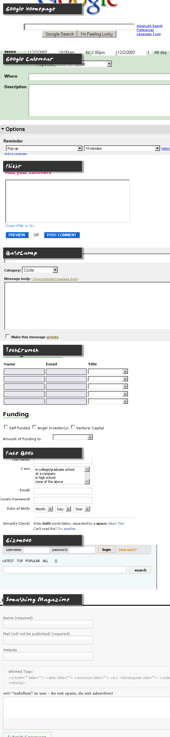 |
|
||
| |
|
|
Clearly, there is a lot of difference in the way people feel about form element styling. Of all the applications above, though, I have to say that Google Calendar and BaseCamp are the most pleasing (to me). BaseCamp seems to be the most non-invasive of all the applications; all of their interfaces rely on clean layouts and system-inherent form styling.
The Google Calendar was a bit of a curve ball to me as it did style its form elements, but still in a very pleasing and natural way. I think what works for them is the fact that although they style their Input and Textarea elements, they are still using an inset border (top/left borders are darker than bottom/right borders). This gives the text input area a "cut-out" look which is still very congruent with the inherent form styles of the computer.
You can really see how much difference this subtle effect makes when you compare the Google Calendar interface to that of Face Book or TechCrunch where a solid border is used for text inputs. While both use a 1px border, the inset look of the Google Calendar makes the interface much more familiar and pleasing to use.
So, I guess to wrap it up, I am agreeing with people like David Stamm and 37Signals who keep their form interfaces simple and who use the inherent form display styles of the user's computer and browser. And again, the more I think about this, the more sense it makes - the more transferrable the user's everyday computer experience is to a web site, the more natural their web site experience is going to feel.

Reader Comments
Just don't look at the adobe.com forms anytime soon. ;)
@Todd,
I couldn't get any farther than Adobe.com's new homepage :( Not sure what they were going for.
Yeah we've safely confirmed over on the Coldfusion IRC that I'm the only person in the world who likes the new Adobe look.
Rob
Adobe new look == very lame
Oh, I beg to differ. Mostly I just wanted to use that phrase, but I do take a more moderate stance on this particular issue. The bottom line for me is this: I just need to know - at a glance - that it's a form field. If that one condition is met, then styling is fine.
That 1px border does not disguise the field's Platonic field-ness (and looks nicer, IMO). Removing the borders in favor of a bottom border that looks like you're filling in a Mad Libs page...not so good. Removing all borders and applying a background color...also bad.
Short version: Form styling is fine, but the margin of allowable deviations is small. Go too far and you impede usability.
@Rob,
I am down with that opinion. Nothing is set in stone, and just as with buildings, what ever doesn't bend, breaks. I also agree that the allowable deviations is small. At the same time, and this is also personal, what I have noticed is that whether I *like* the way something looks, my best user experience is with forms that err on not being styled.
I just wish we had some more controls with more flexibility, without having to script for everything. I know something akin to vcl can be achieved with flash or flex but almost all OS's have other form / visual components such as CheckComboBox and MultiCheckComboBox. It's things like multi select list box's most users don't seem to know they have ctrl key let alone how to use it.